
Client / KCTS 9
Roles / User experience design, visual design
Timeframe / August–November 2019
Link / KCTS9.org
KCTS 9 is a PBS member station in the Pacific Northwest. KCTS 9’s existing website had information about the television station, with a TV schedule, blog posts about upcoming programs, assorted informational pages and, oddly, recipes. The next version of the site needed to be an extension of the service KCTS 9 had provided to the community for years, a viewing destination in itself. Other goals of the redesign were to encourage donations and newsletter sign ups.

Problem


Since the organization had little experience with projects on the scale of this redesign, a consulting company was hired to develop the outline of the product. They met with internal stakeholders, presented a plan, and delivered initial screens and components built in Sketch. However, after our engagement with them ended there still remained a lot of work to be done before the new website could be sent to development.
There were additional features and user flows that needed to be planned and designed. The provided designs had fonts, colors, and logo usages that didn’t conform to our brand standards. Accessibility considerations fell short in some cases, such as color contrast and planning for keyboard focus states.
Who were we designing for?
KCTS 9 broadcast viewers are mostly 65+, well-educated and affluent. It was important that they be able to easily navigate the new website, but it was also essential that younger, more tech-savvy users with ample streaming service experience be able to embrace the site.
My role
After the handoff, I was the only designer working on the project. I was responsible for adapting the consultant-provided designs to our needs, creating new screens and interactions, and making design recommendations based on my knowledge of our audience, brand, and accessibility guidelines.
I worked with our project manager and digital director on feature prioritization and planning. I collaborated with two internal developers and an external development team on technical questions and final handoff. And I received guidance from my creative director on brand compliance.

Process
After the consulting agency delivered their designs as a Sketch file, the project manager and digital director inventoried the screens, and made a list of pages that needed to be revised and created. From these requests, I created new screens and features while also updating the provided designs to meet branding and requirements. In some instances, I identified feature gaps and brought them to the attention of the project manager. After delivering the high fidelity prototype, I had ongoing communication with the development team to ensure the quality of the final product.

Solutions


Expanded components with accessibility considerations
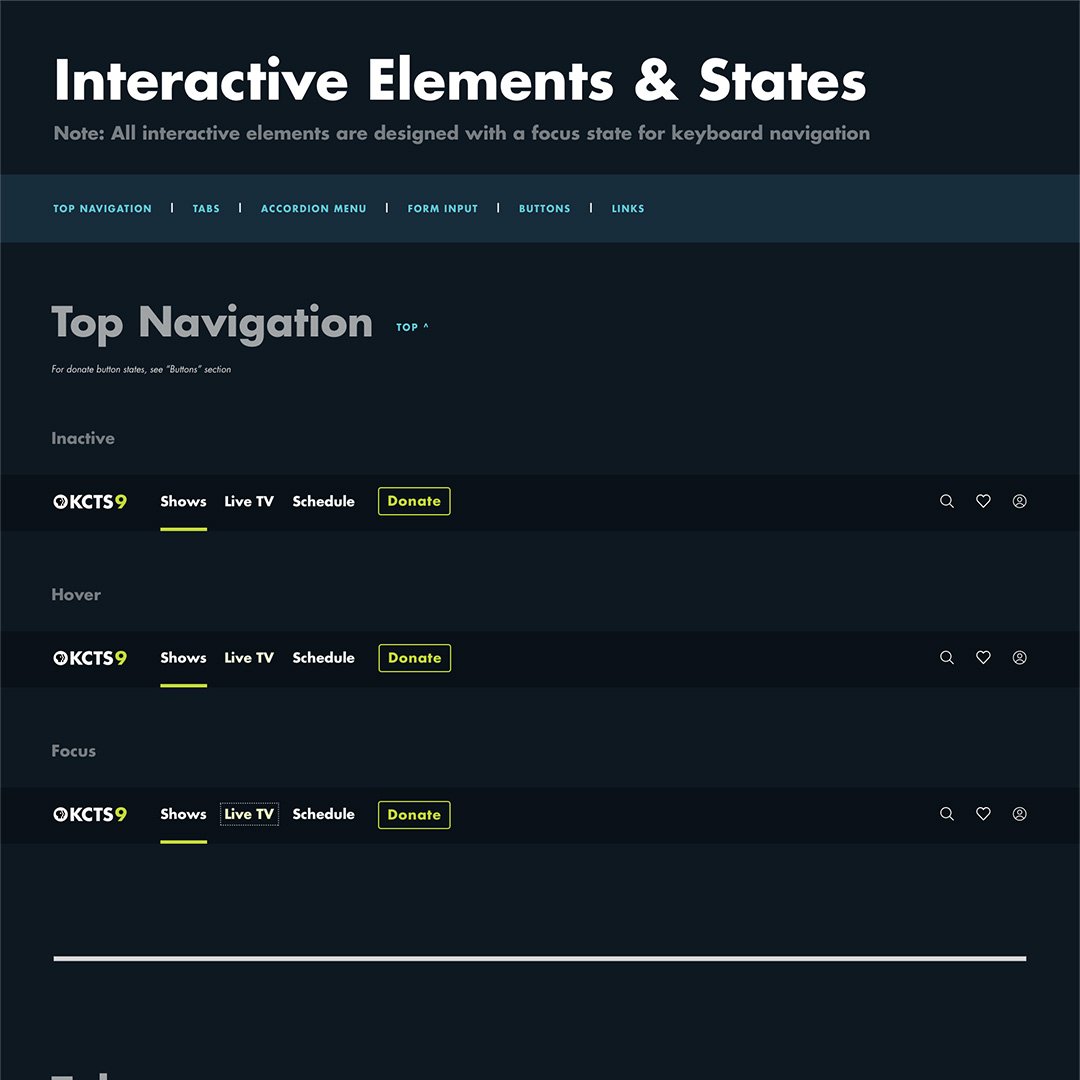
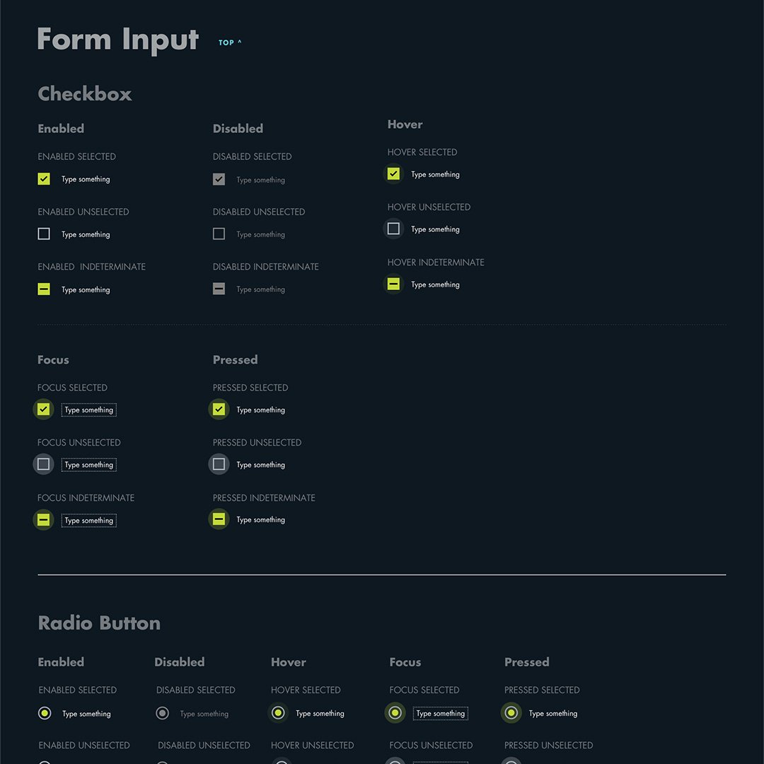
The consulting company had organized the Sketch into pages and components, but many of the smaller elements had not yet been defined. The largest gaps were around focus states and other interactive states. I created a style guide that detailed this information for responsive screen sizes with both light and dark backgrounds, ensuring that every element had color contrast that conformed WCAG 2.0 AA guidelines. I also recommended a skip link at the top of the page and advised on tab order during development.

Fully On-brand
The provided design contained unapproved logo variations, fonts and color combinations. With my extensive knowledge of KCTS 9 brand standards, I revised the designs to be in-line with our standards.

Member Account Management
For the first time, members would be able to manage their accounts directly from KCTS9.org, rather than being redirected to a 3rd party vendor. I designed screens to help members update their contact info, review their donations, and manage communication settings.

Informational Pages
One important page type that was omitted from the original set of designs was the basic page, which would be the template for the site’s informational pages. I chose to create this page on a light background, to increase readability, and included a menu of elements that could be used as needed.

Outcome
A year after relaunch, online donations had increased 192%, site traffic had increased 65%, and the new design received praise from other PBS stations. The new design became the template for cross-platform streaming products that followed, including a Roku app in 2020, and other apps being released throughout 2021 and 2022.
Reflection
A challenge of this project was receiving a large set of designs from the consulting agency with little documentation. I knew that the agency had interviewed some internal stakeholders, but I had no record of their conclusions and wasn’t sure how that information had informed their designs. I was also the only designer, working on a very tight timeline, and had no time or resources set aside for user research or testing.
Despite these hurdles, I was proud of the impact I was able to have on the final product. I used the knowledge I had gained about our users over my three years at KCTS 9 to advocate for our users, particularly the large population of older adults. And I was able to define accessibility features that were overlooked in the first version of the designs.